
Diagnosis Report

Personal Color Report

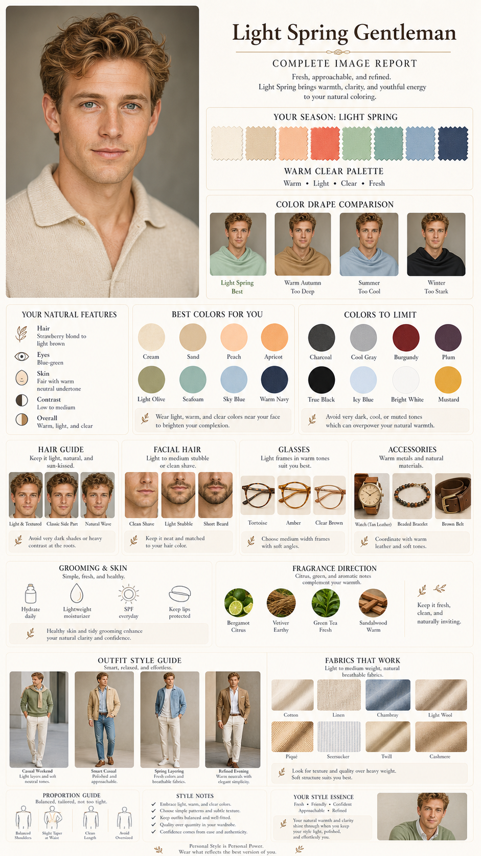
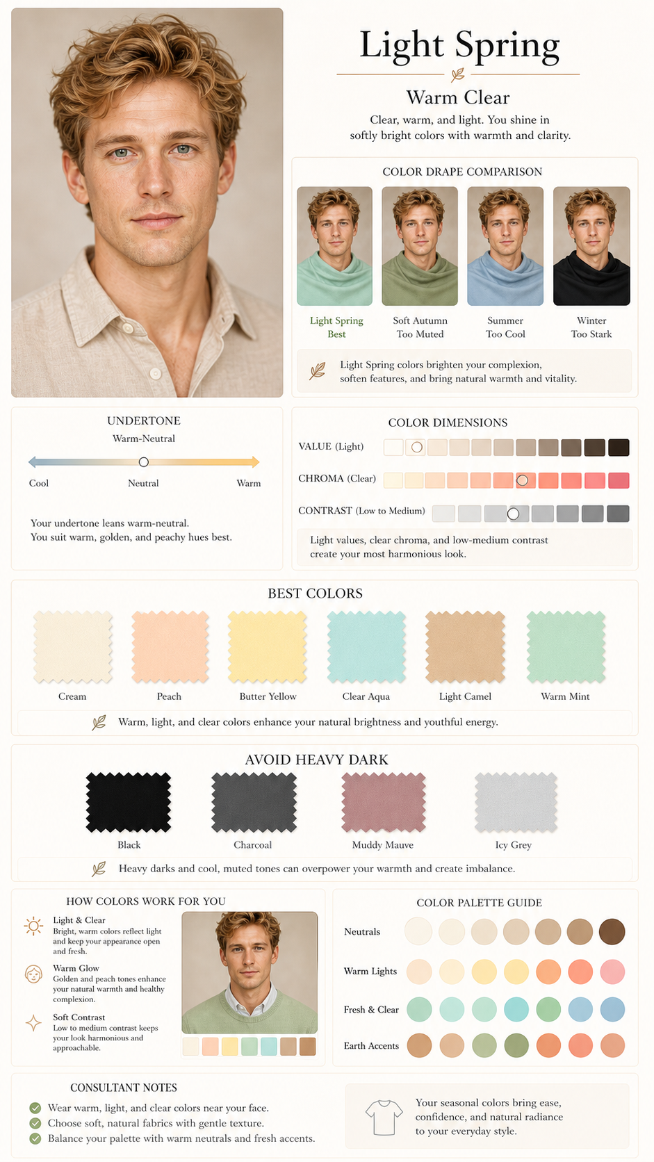
Light Spring · Warm Spring

Warm Springwarm neutrallow mediumfair warm neutral skinlight warm hair
Warm SpringLight SpringLight warm colors make the face look fresh and open. Heavy charcoal, black, and muddy mauve reduce the natural brightness.Confidence89%
SeasonSpringUndertonewarm neutralContrastlow mediumModules8

Before you buy

Photo trustThe photo is clear enough for color and style analysis.Makeup shopping rulesKeep grooming clean, natural, and lightly warm.Hair color riskTry honey beige, light chestnut, or warm milk-tea brown.

Content overview

Use color blocks as shopping references. Check fabric, makeup, and lenses again under natural light.
View full imageOpen the saveable full report

Best color cards

CreamWorks as the core light neutral.PeachAdds approachable warmth.Butter YellowKeeps the palette bright.Warm AquaAdds a clean fresh accent.

Colors to handle carefully

Charcoal BlackToo heavy for the light palette.Muddy MauveLooks muted and tired.
View matching report image
01

01 / Personal Color

Light Spring

Light warm colors make the face look fresh and open. Heavy charcoal, black, and muddy mauve reduce the natural brightness.

CreamWorks as the core light neutral.PeachAdds approachable warmth.Butter YellowKeeps the palette bright.Warm AquaAdds a clean fresh accent.

Works best

Light SpringWarm Spring

Watch-outs

Charcoal BlackMuddy Mauve

How to use it

CreamWorks as the core light neutral.PeachAdds approachable warmth.Butter YellowKeeps the palette bright.Warm AquaAdds a clean fresh accent.

Professional readout

Why it mattersYou do not need another template; save a reusable Personal Color rule that fits you.
Diagnostic evidence
Diagnostic evidenceLight Spring works by making color, material, and contrast support the face; Personal Color should follow the same rule.
Next actions
Save one reusable Personal Color ruleRecord the suitable direction; Mark high-risk choices; Reuse it when shopping or speaking with a specialist; Turn the report into an asset instead of advice you forget after reading.
For your specialist
For your specialistPersonal Color should follow Light Spring for temperature, saturation, and contrast instead of chasing visibility alone.
My assetMy Personal Color assetPersonal Color should keep building around Light Spring: stable, wearable, and reusable.
Suitable directionHigh-risk choicesReusable rule

Confidence noteThe current photos support the overall direction; details can be checked again with natural-light photos.
View matching report image
02

02 / Makeup

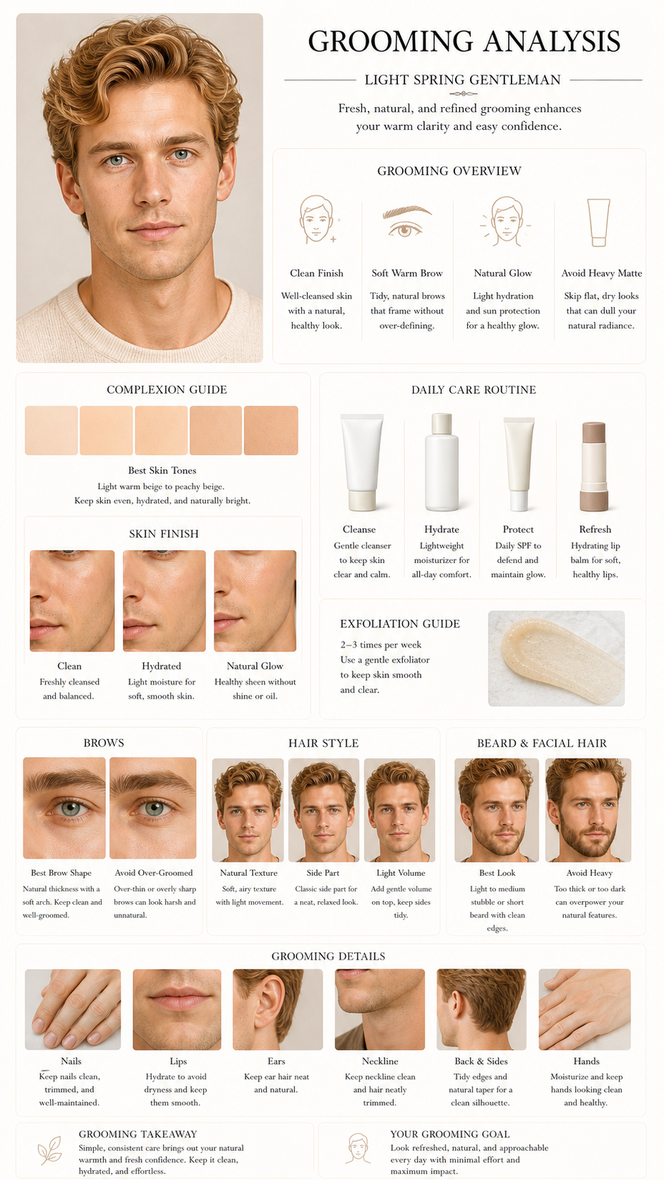
Grooming Analysis

Grooming Analysis turns the visual diagnosis into choices you can use while styling or shopping.

CreamWorks as the core light neutral.PeachAdds approachable warmth.Butter YellowKeeps the palette bright.

Works best

Keep grooming clean, natural, and lightly warm.Avoid heavy matte finish.

Watch-outs

Large mismatched color blocks near the face.Buying only from a trend without checking the palette.

How to use it

Keep grooming clean, natural, and lightly warm.Start here for the highest visual impact.Avoid heavy matte finish.Use as a supporting direction.

Professional readout

Why it mattersYou do not need heavier makeup; keep lip and cheek depth, base glow, and eye definition within a steady range.
Diagnostic evidence
Lip and cheek depthRose brown and milk-tea mauve keep softness without pushing facial contrast too high.Base finishA soft satin-matte finish is more stable than high shine or a fully flat matte base.
Next actions
Set the main lip and cheek colors firstUse rose brown and milk-tea mauve as everyday shopping anchors; Treat saturated orange-red as a careful-test shade; Fixing the main colors first reduces blind buying and unstable try-ons.
For your specialist
For makeup artistKeep lip and cheek saturation low to medium, preserve a soft satin base, and use gray-brown or soft rose around the eyes.
My assetMy makeup assetA reusable rule set for lips, cheeks, base finish, and eye definition.
Rose-brown lip colorMilk-tea mauve blushSoft satin-matte base

Confidence noteThe current photos support makeup direction; foundation shade and concealer brightness should still be checked in natural light.

View matching report image
03

03 / Outfit

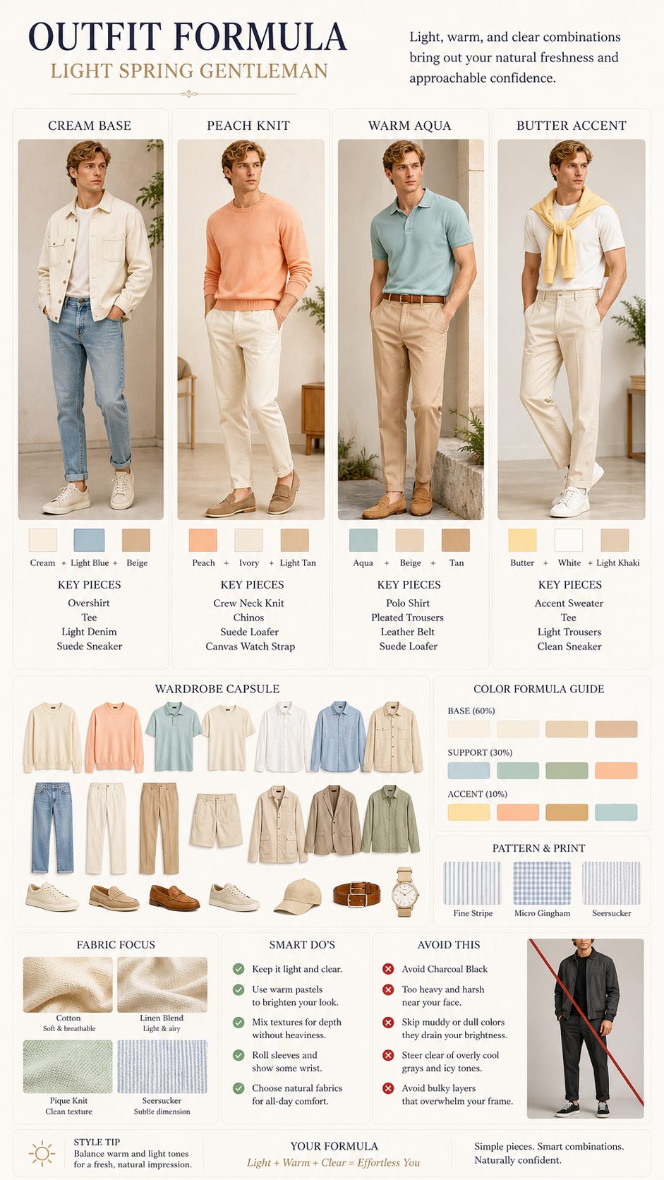
Outfit Formula

Outfit Formula turns the visual diagnosis into choices you can use while styling or shopping.

CreamWorks as the core light neutral.PeachAdds approachable warmth.Butter YellowKeeps the palette bright.

Works best

Build from cream, peach, warm aqua, light denim, and tan.Avoid charcoal black as a dominant color.

Watch-outs

Large mismatched color blocks near the face.Buying only from a trend without checking the palette.

How to use it

Build from cream, peach, warm aqua, light denim, and tan.Start here for the highest visual impact.Avoid charcoal black as a dominant color.Use as a supporting direction.

Professional readout

Why it mattersYou do not need another template; save a reusable Outfit rule that fits you.
Diagnostic evidence
Diagnostic evidenceLight Spring works by making color, material, and contrast support the face; Outfit should follow the same rule.
Next actions
Save one reusable Outfit ruleRecord the suitable direction; Mark high-risk choices; Reuse it when shopping or speaking with a specialist; Turn the report into an asset instead of advice you forget after reading.
For your specialist
For your specialistOutfit should follow Light Spring for temperature, saturation, and contrast instead of chasing visibility alone.
My assetMy Outfit assetOutfit should keep building around Light Spring: stable, wearable, and reusable.
Suitable directionHigh-risk choicesReusable rule

Confidence noteThe current photos support the overall direction; details can be checked again with natural-light photos.
View matching report image
04

04 / Hairstyle

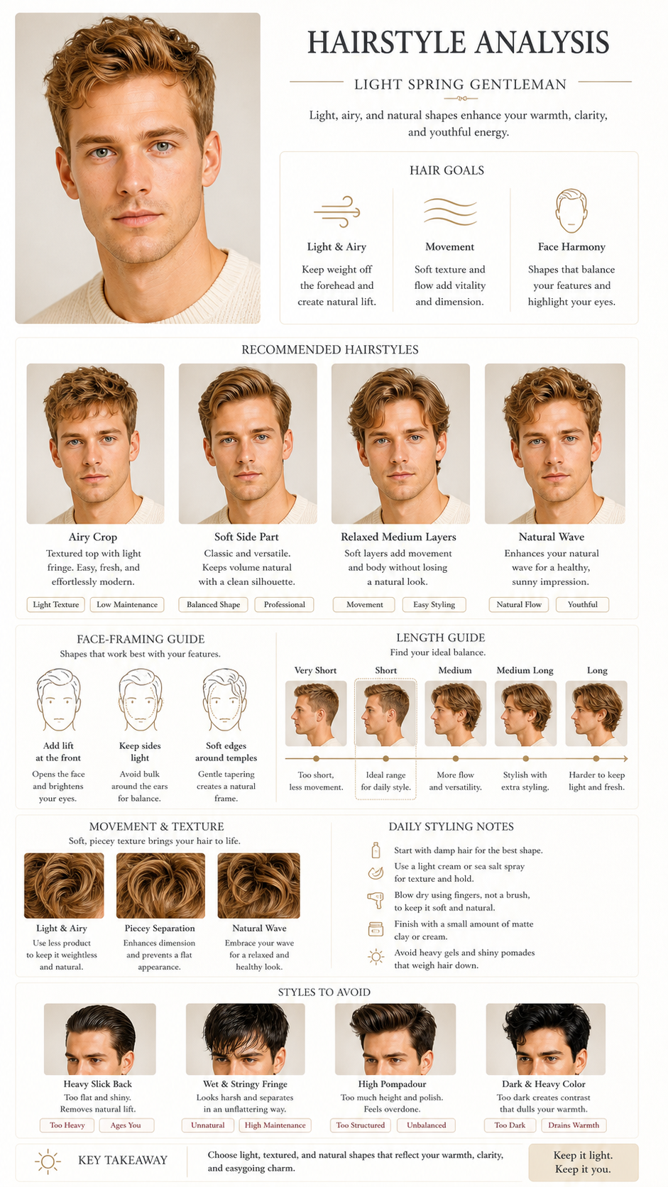
Hairstyle Analysis

Hairstyle Analysis turns the visual diagnosis into choices you can use while styling or shopping.

CreamWorks as the core light neutral.PeachAdds approachable warmth.Butter YellowKeeps the palette bright.

Works best

Use airy crop, soft side part, or natural wave.Avoid heavy wet styling.

Watch-outs

Large mismatched color blocks near the face.Buying only from a trend without checking the palette.

How to use it

Use airy crop, soft side part, or natural wave.Start here for the highest visual impact.Avoid heavy wet styling.Use as a supporting direction.

Professional readout

Why it mattersYou do not need another template; save a reusable Hairstyle rule that fits you.
Diagnostic evidence
Diagnostic evidenceLight Spring works by making color, material, and contrast support the face; Hairstyle should follow the same rule.
Next actions
Save one reusable Hairstyle ruleRecord the suitable direction; Mark high-risk choices; Reuse it when shopping or speaking with a specialist; Turn the report into an asset instead of advice you forget after reading.
For your specialist
For your specialistHairstyle should follow Light Spring for temperature, saturation, and contrast instead of chasing visibility alone.
My assetMy Hairstyle assetHairstyle should keep building around Light Spring: stable, wearable, and reusable.
Suitable directionHigh-risk choicesReusable rule

Confidence noteThe current photos support the overall direction; details can be checked again with natural-light photos.
View matching report image
05

05 / Haircolor

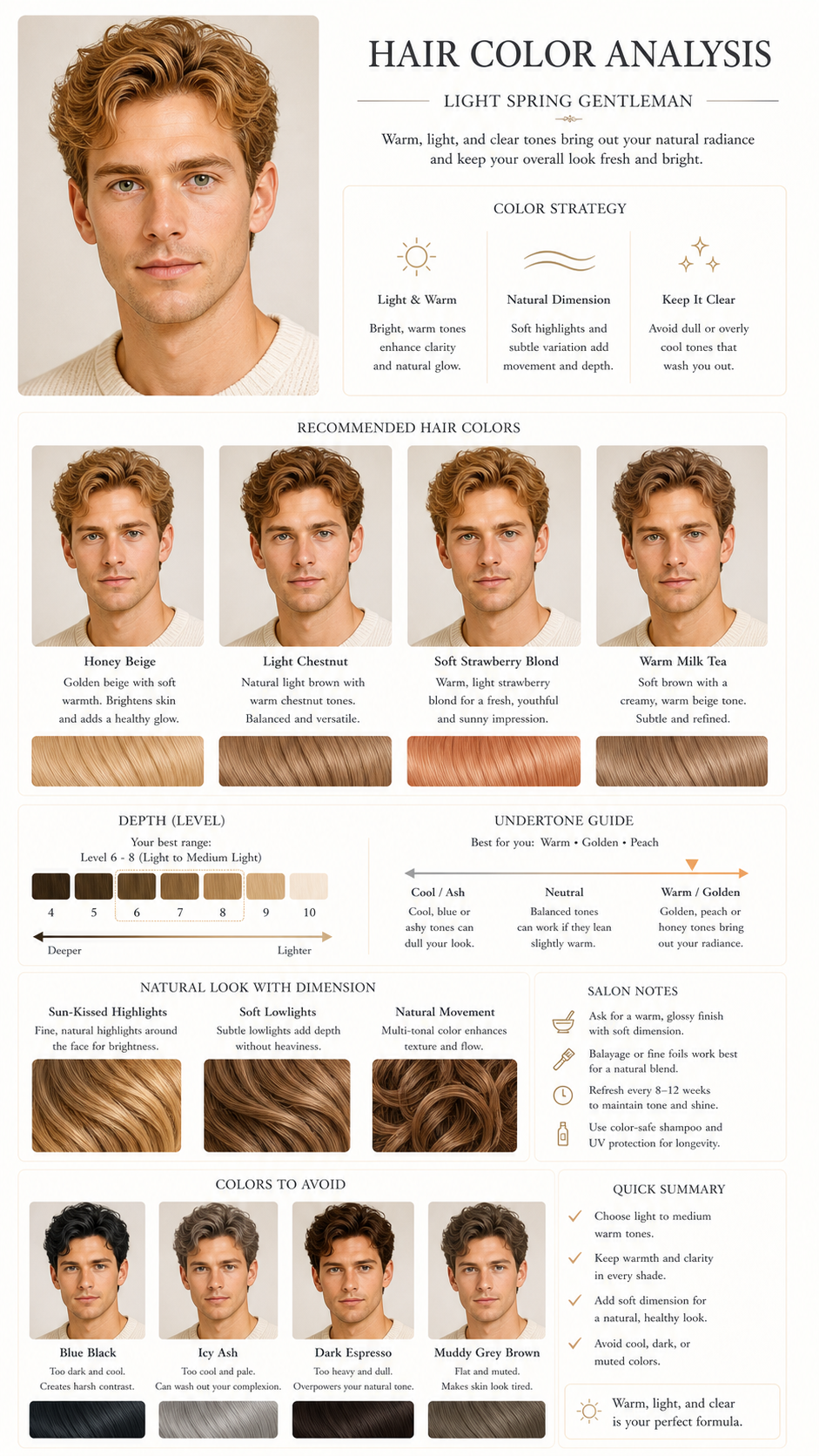
Hair Color Analysis

Hair Color Analysis turns the visual diagnosis into choices you can use while styling or shopping.

CreamWorks as the core light neutral.PeachAdds approachable warmth.Butter YellowKeeps the palette bright.

Works best

Try honey beige, light chestnut, or warm milk-tea brown.Avoid blue black and icy ash.

Watch-outs

Large mismatched color blocks near the face.Buying only from a trend without checking the palette.

How to use it

Try honey beige, light chestnut, or warm milk-tea brown.Start here for the highest visual impact.Avoid blue black and icy ash.Use as a supporting direction.

Professional readout

Why it mattersYou do not need another template; save a reusable Hair Color rule that fits you.
Diagnostic evidence
Diagnostic evidenceLight Spring works by making color, material, and contrast support the face; Hair Color should follow the same rule.
Next actions
Save one reusable Hair Color ruleRecord the suitable direction; Mark high-risk choices; Reuse it when shopping or speaking with a specialist; Turn the report into an asset instead of advice you forget after reading.
For your specialist
For your specialistHair Color should follow Light Spring for temperature, saturation, and contrast instead of chasing visibility alone.
My assetMy Hair Color assetHair Color should keep building around Light Spring: stable, wearable, and reusable.
Suitable directionHigh-risk choicesReusable rule

Confidence noteThe current photos support the overall direction; details can be checked again with natural-light photos.
View matching report image
06

06 / Accessory

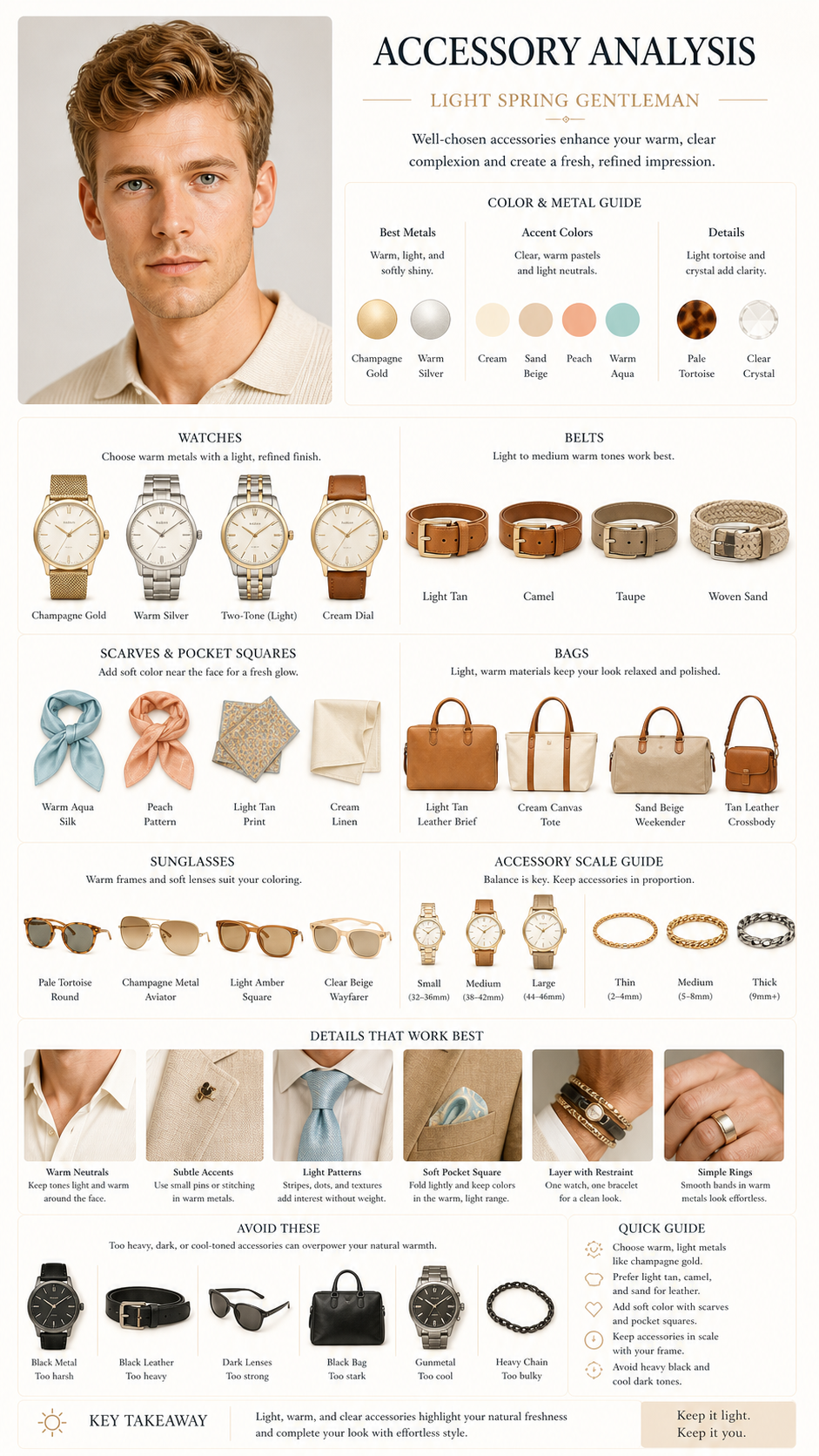
Accessories Analysis

Accessories Analysis turns the visual diagnosis into choices you can use while styling or shopping.

CreamWorks as the core light neutral.PeachAdds approachable warmth.Butter YellowKeeps the palette bright.

Works best

Choose champagne metal, light tan leather, cream canvas, and warm aqua.Avoid heavy black accessories.

Watch-outs

Large mismatched color blocks near the face.Buying only from a trend without checking the palette.

How to use it

Choose champagne metal, light tan leather, cream canvas, and warm aqua.Start here for the highest visual impact.Avoid heavy black accessories.Use as a supporting direction.

Professional readout

Why it mattersYou do not need another template; save a reusable Accessories rule that fits you.
Diagnostic evidence
Diagnostic evidenceLight Spring works by making color, material, and contrast support the face; Accessories should follow the same rule.
Next actions
Save one reusable Accessories ruleRecord the suitable direction; Mark high-risk choices; Reuse it when shopping or speaking with a specialist; Turn the report into an asset instead of advice you forget after reading.
For your specialist
For your specialistAccessories should follow Light Spring for temperature, saturation, and contrast instead of chasing visibility alone.
My assetMy Accessories assetAccessories should keep building around Light Spring: stable, wearable, and reusable.
Suitable directionHigh-risk choicesReusable rule

Confidence noteThe current photos support the overall direction; details can be checked again with natural-light photos.
View matching report image
07

07 / Glasses

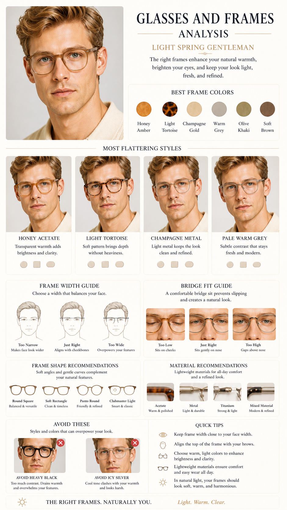
Glasses and Frames

Glasses and Frames turns the visual diagnosis into choices you can use while styling or shopping.

CreamWorks as the core light neutral.PeachAdds approachable warmth.Butter YellowKeeps the palette bright.

Works best

Use honey acetate, light tortoise, champagne metal, or pale warm gray.Avoid heavy black frames.

Watch-outs

Large mismatched color blocks near the face.Buying only from a trend without checking the palette.

How to use it

Use honey acetate, light tortoise, champagne metal, or pale warm gray.Start here for the highest visual impact.Avoid heavy black frames.Use as a supporting direction.

Professional readout

Why it mattersYou do not need another template; save a reusable Glasses and Frames rule that fits you.
Diagnostic evidence
Diagnostic evidenceLight Spring works by making color, material, and contrast support the face; Glasses and Frames should follow the same rule.
Next actions
Save one reusable Glasses and Frames ruleRecord the suitable direction; Mark high-risk choices; Reuse it when shopping or speaking with a specialist; Turn the report into an asset instead of advice you forget after reading.
For your specialist
For your specialistGlasses and Frames should follow Light Spring for temperature, saturation, and contrast instead of chasing visibility alone.
My assetMy Glasses and Frames assetGlasses and Frames should keep building around Light Spring: stable, wearable, and reusable.
Suitable directionHigh-risk choicesReusable rule

Confidence noteThe current photos support the overall direction; details can be checked again with natural-light photos.
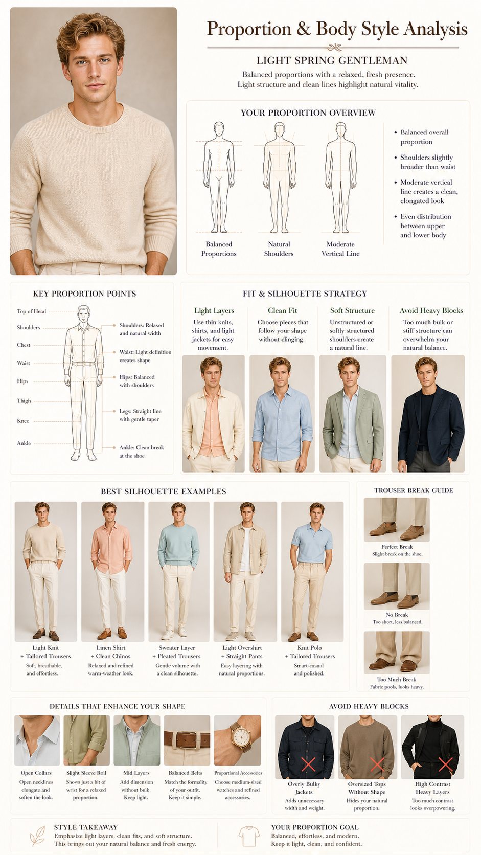
View matching report image
08

08 / Pear Body

Body Shape Style Analysis

Body Shape Style Analysis turns the visual diagnosis into choices you can use while styling or shopping.

CreamWorks as the core light neutral.PeachAdds approachable warmth.Butter YellowKeeps the palette bright.

Works best

Use clean fit, light layers, and soft structure.Avoid heavy blocks.

Watch-outs

Large mismatched color blocks near the face.Buying only from a trend without checking the palette.

How to use it

Use clean fit, light layers, and soft structure.Start here for the highest visual impact.Avoid heavy blocks.Use as a supporting direction.

Professional readout

Why it mattersYou do not need another template; save a reusable Body Shape Style rule that fits you.
Diagnostic evidence
Diagnostic evidenceLight Spring works by making color, material, and contrast support the face; Body Shape Style should follow the same rule.
Next actions
Save one reusable Body Shape Style ruleRecord the suitable direction; Mark high-risk choices; Reuse it when shopping or speaking with a specialist; Turn the report into an asset instead of advice you forget after reading.
For your specialist
For your specialistBody Shape Style should follow Light Spring for temperature, saturation, and contrast instead of chasing visibility alone.
My assetMy Body Shape Style assetBody Shape Style should keep building around Light Spring: stable, wearable, and reusable.
Suitable directionHigh-risk choicesReusable rule

Confidence noteThe current photos support the overall direction; details can be checked again with natural-light photos.